Batman Eternal #1 & 2 (DC Comics, $2.99 ea)
by Graig Kent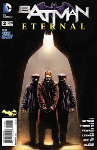
Have you ever heard a riff on a familiar tune that’s not a cover song per se, but a song that tonally fools you into thinking it’s something you know, but it’s just different enough that you know it’s not? Did you find it comforting, or did it drive you bananas?
Pop music radio has been treading on this idea of homogeneity for over 60 years, finding that the largest audiences do not want to be challenged by radically different sounds, and these days algorithms provide set lists that maximize the absence of variance. But it’s not just pop music, virtually every major on-line retailer or content provider has an “if you liked X, try Y” recommendation system. Well before the digital age, movie and television studios had striven to dilute the success of what’s worked in the past. It’s deemed safe-betting on their parts, duplicating what works, ad nauseum, with little mind to creative merit or integrity.
Even a much smaller medium like comics are not immune to this type of tunnel vision. It’s especially in the past 25 years when the major players have tripped over each other to reach the same small audience with variations of the same product. This is not to say that some of that product is not better than others — the cream will always rise to the top, so to speak — but that all too often mainstream comics just feel like a half-assed shepherd’s pie made out of leftovers. Batman Eternal is such a product.
Eternal aims to take one of the few things that’s been working well in the New 52, which is to say Batman, and milk it even further. The powers that be at DC have recognized that what’s been most successful about Batman since the reboot have been the grander story arcs (Court of Owls, Death of the Family), but also acknowledge the creative talent have largely maintained a stable Bat-family line for the past two years. Looking back even further, DC can’t help but recall one of their biggest and most ambitious successes, 52, (it’s on every one of their covers for the past three years afterall), a year-long, weekly mini-series that brought together four of comics greatest creators into an event all its own.
But all these wonderful parts do not make for a scintillating whole, not at all. DC’s current golden boy (second only to Geoff Johns) Scott Snyder has kept Batman as the marquee title for the New 52, with nary a real contender. He’s fostered James Tynion IV into the company by way of some phenomenally well-written back-up stories in that same book, so one would suspect that, along with Ray Fawkes, Tim Seeley and John Layman, they could concoct a real doozy of a Bat-tale worthy of a weekly series and the hype that goes along with it. Turns out, not so much.
Eternal starts off with a one page glimpse at the future, Batman unmasked and bloody, strapped to the Bat signal. It’s a disarming visual that, if the pace of the subsequent 39 pages is any indication, is a long way off in the story. The first two issues play out with all the energy of a tired 1980’s police drama. Jim Gordon is set up in an inconceivably elaborate ruse to apparently cause a massive subway disaster, and is subsequently arrested (though on what actual charges is anyone’s guess). Gordon’s aware immediately he’s been set up, Batman’s sure of it too, as are Gordon’s key allies (Bullock, Sawyer, the token new guy) but one outrageously corrupt Major is set on putting him down.
The script tries hard to create a gripping police drama, but it’s like it only has some dusty old VCR tapes to guide it. The dialogue is far too pointed and unnatural such that it frequently teeters on self-parody, and with Jason Fabok’s art for the second issue tasked with keeping one character’s face in the shadows or cropped off-panel for the entire book in highly awkward ways, it truly does become a joke. Plus, when said character is finally revealed as the “big bad”, I laughed out loud at the absurdity of the weight put behind it. Without spoiling it, this character has never really had any major role to play in Batman’s past (though he’s kind of omnipresent) and his new moniker, “The Roman”, as well as Catwoman’s The Room-worthy reaction shot, had me groaning and chuckling in equal measure.
I don’t know if Snyder, Tynion IV, Fabok and company were intending this to be a pulpy lark, but at this stage if the book is going to have any merit, it may well be as a ridiculous, overblown, so-bad-it’s-good anti-failure. But I think it’s intention is to be far too earnest, lacking any real self awareness, and as such it’s fine, but homogenous.. a tune I’ve heard all too often.
Rating: 
![]()
![]()
![]()
Out of a Possible 5 Stars
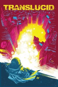 Translucid #1 (Boom!, $3.99)
By Cat Taylor
I’m a real sucker for comic books that take the established superhero conventions and deconstruct some aspect of them in a little-examined way. Of course it’s generally accepted that Alan Moore deconstructed the superhero genre better than anyone in Watchmen and anything that has attempted to do so since will inevitably be compared to the “gold standard” set by that series. Unfavorable comparisons typically occur when a writer takes the most obvious and least original pieces of Watchmen (the anti-hero, the psychologically fragile hero, ultra-violence, etc.) and uses those to perpetuate what has become a poorly imitated sub-genre. On the other hand, comparisons can be more favorable when a writer is able to find and explore some element that Moore missed or didn’t explore deeply enough. This new limited series, Translucid, explores the co-dependent relationship between the hero and arch-nemesis. It’s an aspect that Moore didn’t really deal with in Watchmen but it’s not exactly an original idea either, since numerous writers have explored this idea, most frequently between Batman and the Joker, which was most notably and effectively done by Frank Miller in The Dark Knight Returns. So, the question remains as to whether or not Translucid will have anything to say on the subject that hasn’t already been said better elsewhere. As of the end of the first issue, that question is unanswered.
Although I don’t want to ruin potential enjoyment of the series by providing spoilers, as a reader myself I know that it’s important to have some idea of a comic’s basic plot to help me decide whether it is something I might enjoy or not. Basically, the “Superman” of this story, known as the Navigator, has become less active and less dynamic since his arch-enemy has been in prison over the last few years. His arch-enemy is aware of this and thinks it’s important to become active again, primarily to determine if the hero still has the moral fiber, dedication, etc. to be the hero that the city deserves. He does this by creating a master plan to test the hero. Without giving anything away, I’ll just say that what the villain thinks the hero’s actions should be and why, were different than I had guessed. Defying my expectations in this matter is what has aroused my interest in continuing the series and what has given me hope that this series has the potential to be one of the undiscovered greats.
Speaking of the arch-villain in this issue, while his thought patterns and motivations are pretty interesting, the character design itself is about as lame as villain gimmicks get. The villain is named,” the Horse.” Guess what his costume looks like? If you said, a three piece suit with a helmet that looks like the head of a merry-go-round horse, you would be sadly correct. It’s the kind of character design I would have expected to be played for laughs in The Tick, as opposed to the motif for the top villain of the Translucid universe. Heck, all three of the lesser villains in the series have more interesting names and appearances. Considering the high quality work of artist, Daniel Bayliss, as well as some very competent writing by Chondra Echert and Claudio Sanchez, I wonder if there is a well thought out reason for the character name and design being so lame, or if they think a villain named the Horse who wears a horse-head as his costume is an awesome idea. Unfortunately, the design of the hero’s costume isn’t much better. However, this series isn’t really about awesome costumes and powers. It’s more about hero-villain co-dependence. So, if the story remains strong, the costumes and names will be so superficial that they won’t really matter. The fact that my initial reaction to seeing the Horse was merely “seriously?” rather than outright laughter says a lot for the quality of the story.
If the next few issues remain at this level, at worst, Translucid will be one of the better superhero comic book stories on the shelves. At best, the level of writing will get deeper and more unpredictable as the series progresses and it will end up being one of the best under-appreciated gems on the market.
Rating: ![]()
Out of a Possible 5 Stars
Solar: Man of the Atom #1 ($3.99, Dynamite)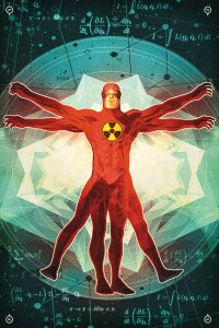
by D.S. Randlett (@dsrandlett)
Another month, another Gold Key relaunch from Dynamite. Like my beloved Turok and my liked-kinda-alright Magnus, I was introduced to Solar during his stint as a Valiant character in the nineties, for whom he was arguably the flagship. I could never figure this out. My guess was that this character was essentially a Superman stand in for the Valiant Universe of the nineties, but the character was never driven by the things that make Superman so important: ideals. Solar was to me a simple power house character with vague abilities, or at least ones that my younger self could not understand. Still, the character seemed to be lacking a core for him to really stick in my mind, despite the sometimes appealing romanticism that could envelop the character from time to time. As I got older, the character transitioned from a Superman ripoff in my mind to a Flash ripoff by dint of his physics-based adventures (or at leat, physics-based solutions to his problems). But again, he seemed to lack the essential core element that makes superheroes work and stick.
Writer Frank J. Barbiere starts his run with a strong entry, and he seems to recognize that Solar just doesn’t work when approached from a superhero angle. While the book does open with the titular hero foiling a bank robbery, what happens next seems to hint that The Man of the Atom might be facing challenges far closer to home. For one, his vast power is spiralling out of control, and may very well be killing him.. For one, Solar, or Dr. Phil Seleski, might be dying. Barbiere shrewdly uses the vagueness of Solar’s powers to fuel the story. Throughout the captions, it’s implied that Solar can manipulate what he can understand. Barbieri gets this across by presenting Seleski’s understanding by means of physics and chemistry equations. But what about those things in the universe that the sciences haven’t yet comprehended? Can Seleski cope with what he doesn’t know? As it turns out… maybe he can’t. Another plot involves his estranged daughter, a young architect, who doesn’t wish to speak to him. Seleski, it appears, was a negligent father, too wrapped up in his work to make time to understand his children. And of course there’s that imposing space ship observing the Earth from orbit. As this is a first issue, these interwoven variations on the same theme don’t pay off yet, but they make what story that’s here compelling on its own terms and worth following into the future.
Another cause to follow Solar: artists Joe Bennett and Lauren Affe. Bennett’s pencils recall the work of another Solar artist: Barry Windsor Smith. There’s also a touch of Barry Kitson in there, and Steve Rude. Affe’s colors also recall the excellent Valiant watercolor style of the nineties (which I always really liked). In terms of visuals, this Gold Key relaunch bears the closest resemblance to its forebears, but it’s an approach that absolutely works for this story and character in addition to being simply gorgeous.
The team behind this book found an approach to Solar that just flat out works. He’s not a superhero: he’s a character in a science fiction story. Strong writing and great art make this an easy recommendation.
Rating: 
Out of a Possible 5 Stars
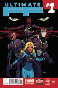 Ultimate FF #1 (Marvel, $2.99)
By Jeb D.
Say what you will about Mark Millar (and I’ve said plenty), but The Ultimates demonstrated that he was one of the first comic creators to really embrace the fact that the Ultimate universe allowed a writer to break up the usual superhero toys, without having to worry about endangering the all-important merchandising opportunities. And while you’d think that would be some kind of storytelling slam-dunk opportunity, even writers as capable as Mike Carey, Robert Kirkman and Brian K Vaughan failed to fully exploit the opportunity that this presented to re-make and re-model. Joshua Hale Fialkov is the latest indie darling to start playing in the Ultimate sandbox, and he seems to be gleefully ready to blow shit up.
Although it borrows the “FF” designation (rather than “Fantastic Four”) from the regular Marvel U, this “Future Foundation” is a far cry from Hickman’s school for gifted aliens, oddballs, and super-beings; instead, this Future Foundation is Sue Storm and three of the Ultimate U’s other brainiacs: Tony Stark, Danny “Machine Man” Ketch, and Sam “Falcon” Wilson, with support from Ultimate Phil Coulson. Fialkov is clearly less interested in how these wildly mismatched supers would function as a team, than he is in putting four smart, prickly, people in close proximity to one another, and letting the snark fly. In fact, the threat they deal with this time is more or less the sci-fi equivalent of a superhero intervening in an alley mugging just to establish their credentials: preventing innocent people from being turned into trans-dimensional monsters doesn’t really call for much in the way of smarts or initiative, but it is a good way to make room for dialog that helps define a set of personalities that, even to the regular Ultimate reader, could probably use the extra definition. We’re post-Galactus and post-Cataclysm here, so upping the stakes is probably the biggest challenge facing the new creative team; it’s the ideal setting for someone not afraid of smashing up the crockery, and from the sound of his note in the backmatter, that is very much Failkov’s intention in future issues, but so far, it’s a strong, but fairly by-the-numbers intro to what could prove to be an interesting, unusual superteam, with a neat twist at the end for longtime Ultimate universe readers.
The art by Mario Guervara and Tom Grummett , with inks from Juan Vlasco and colors from Rachelle Rosenberg, is going to be very much a matter of taste here. To Guervara and Grummett ‘s credit, there’s nothing clichéd about it: this isn’t standard house-style big spandex. It has some of the scrappy energy that Dexter Soy brought to the Captain Marvel series, but there’s a wonky quality to things like perspective and anatomy; and where Soy exuded a confidence in his technique that allowed him to break (or at least) bend the rules to generally good effect, Guervara and Grummett ‘s work here too often just feels rough and inconsistent, and they’re definitely better with masks than with actual human faces.
With its hipper-than-thou personality clashes, and nods toward forward-looking science, Ultimate FF #1 feels a lot like one of Warren Ellis’ Ultimate books, which means it’s probably no coincidence that its big reveal at the end nods back to one of Ellis’ more controversial choices. This first issue leaves us up in the air about future direction: Fialkov’s intent to shake things up is laudable, but so far I wonder if we’re not actually looking at the Ultimate U’s version of Avengers AI: a fairly conventional superhero yarn about super-smartasses, with a few good jokes thrown in; either way, stronger art will definitely help.
Rating: ![]()
![]()
Out of a Possible 5 Stars
Healed #4 (Homeless, $2.99 printed copy, $1.99 digital copy)
By Cat Taylor
About a month ago I wrote a review for the second issue of Healed and expressed how impressed I was with the unique approach to the subject matter of a future when all sickness was eliminated. Since Comixology often adds digital versions of comics many years after they have been on the stands, I wasn’t aware that the “future” in this story was 2011. So, any comments I made about hopes for the future of the series matter about as much as any hopes for the outcome of the 2008 presidential race at this point. Regardless, since new volumes of this old series are still being newly added in digital form to the Comixology website, I thought it would be a good time to catch up and review the latest volume of the series.
Fortunately, the writer, George O’Connor, continues to intrigue and find new aspects of this complex issue to explore. This most recent issue deals with the discovery of someone who recently died of natural causes and the quick reactions by the “evil” Vaness-Headley Corporation trying to figure out how this is possible. In my last review, I remarked that as of the second issue a clear protagonist still hadn’t emerged. Here in issue #4 that’s still more or less the case. However, the “one-dimensional corporate bitch” as I called her, Donna Gibbs, has become the central character that drives the story. It’s interesting to have a main character be someone with still no redeeming qualities, but the first four issues have been impressive despite this unusual approach. I still think that some of the lesser characters will take over the series before it is all over because surely they aren’t just going to sit back and watch stuff happen. After all, this is the comic book world where the readers want their heroes, even if they don’t wear spandex and have superpowers. I also recall expressing my disappointment at the poor quality of Griffin’s artwork for such an excellent story. Unfortunately, Griffin is still drawing the book as of this issue and still appears to be putting in minimal effort. I would love to see this series anthologized and redrawn by someone who at least appears to be trying. It’s very frustrating to see such a mismatched pair of creators.
If you’ve heard about this series and have been curious but hesitant, trust that the quality of the writing continues to be strong and interesting. You could do far worse for your digital dollar and aren’t likely to do a lot better.
Rating: ![]()
Out of a Possible 5 Stars