One intriguing phase of film production that viewers rarely get to see, even in exhaustive behind-the-scenes special features, is the kitchen-sink marketing development stage where artists and graphic designers lob out an assortment of poster concepts to see what sticks. For a large movie like The Dark Knight Rises, often several different companies will be churning out designs, competing to get the gig. Sometimes, looking back at these variety of posters there will be bizarre gems (generally shot down because they’re too avant-garde or niche; this site features some interesting examples), or laughable what-were-they-even-thinking embarrassments.
The folks at Trailer Park, Inc were just such a company lobbing out designs for the TDKS gig. While none of their unused designs were criminally passed over by Warner Bros, I do like this one…
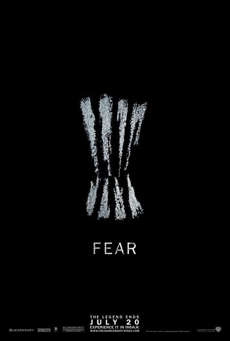
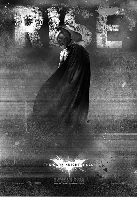
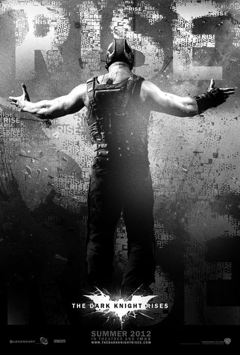
That could have made for an intriguing teaser. The other two designs they posted on their site are fairly run-of-the-mill for our current era of poster designs.





3 comments
The first one is pretty cool…though it is probably better suited for the inevitable remake of Jaws.
I still haven’t seen this because I can’t get past the asinine title. They might as well have called it Dark Knight Into Darkness.
The first one looks way more like a Mondo for Attack the Block.
Comments are shown as archived from the original site; new comments are closed.