
Tron
This is another cool little movie-related diversion I’ve encountered today, and another that doesn’t seem to have spread like wildfire across the movie blogosphere quite yet.
It’s a blog called MovieBarcode, and it takes every frame of individual films and compresses them into a single image. I’m not sure what the exact scheme is since each image is 1280×480 (which means they’re all equally condensed, regardless of runtime), and that rules out each frame being reduced to a 1px width or something simple like that. Whatever the method, it results in very interesting pictures that give you the visual impression and an idea of the general color palette of a film in a very simple and direct way. To give you an example, I’ve snagged a few from some recent OSCAR winners and nominees, which you can see below.
It’s interesting to note some different kinds of format changes that are visible. For example; you can easily see the camcorder segments of Exit Through The Gift Shop, the age of Wizard of Oz, or the vaguely compositional differences in a film shot in black and white.
The blog is clearly new, but has backlogged enough titles to be worth a few minutes of attention, along with an add to your RSS or Tumblr feed. My one gripe is that the images are relatively low-resolution, when they would make great desktop backgrounds- I hope they get upped to something a bit heartier in the future (though the dimensions suggest the person behind this is using SD versions of the film, to make the process more manageable I would imagine). I’d also love to know more about the process behind these.
Check it out and let us know what your favorite examples are in the comments below, or on the message boards.
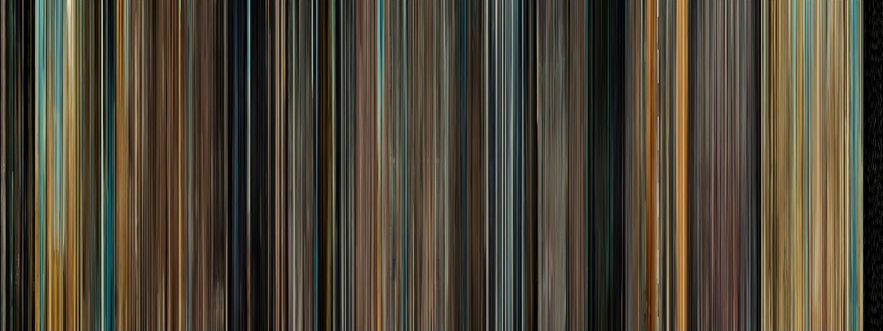
127 Hours
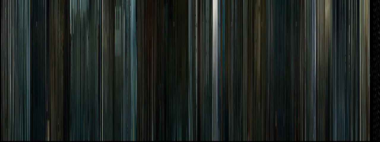
The King's Speech

Inception

Exit Through The Gift Shop
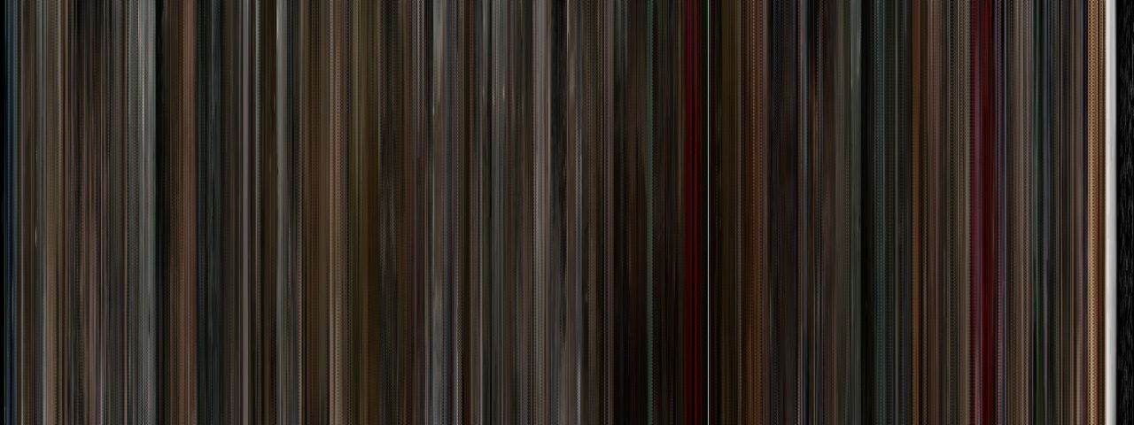
Black Swan
via Gizmodo
DISCUSS THIS on the CHUD Message Board
&
Like / Share it on Facebook (above or below) if you think it’s great!





4 comments
Woah, that is just CREEPY. I originally thought these were going to be dumb and pointless, but the second I looked at each picture I could describe EXACTLY what was happening at each color change. That is just weird!
I’d love to have some of these on my walls.
Great idea. Definite print/poster potential there. What the hell happens in the middle of Die Brücke (1959)?
Hope he does Toy Story 3. The color use in that was incredible.
Doesn’t really work for black & white films.
Comments are shown as archived from the original site; new comments are closed.