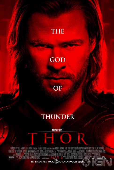
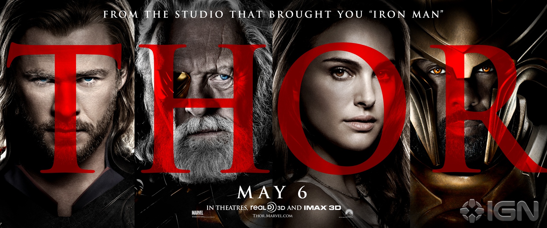
Marvel must have noticed how strong the reaction to Red Skull’s debut was yesterday and tossed a red filter on their newest Thor poster with the fury. A new banner also sports some big red letters atop the standard high-contrast, super-grainy one-sheet portraiture. I get that there are billing issues and everything, but shouldn’t Hopkins be under the “O” for Odin?
I suppose the big red Thor poster is an attempt to downplay the cartoony/comic-booky nature of the film and sell it as a grittier, meaner film to whoever that might appeal. If this is the only image anyone ever sees for the film, sure, that might work. Otherwise… whatever happened to marketing consistency?
Also, while Natalie Portman sure is purty, is it just me or has there been some kind of terrible fucking resizing incident that has left her bobble-headed? She’s a thin girl, and there’s some shadow illusion going on, but that shoulder looks far too small to me.
Either way, enjoy these Friday afternoon borings on your way out of the door. (via IGN)
Thanks to Brian Henne
DISCUSS THIS on the CHUD Message Board
&
Like / Share it on Facebook (above or below) if you think it’s great!





6 comments
That’s some myers87 goodness on top there.
I don’t get it. In this day and age of digital color correction, how can a poster drawn completely up and down and through the red scale make it to final copy? Wait. It’s suppose to be red? Great. This is the next evolution in dumb Big Head posters. Single colored Big Head posters. Not to mention writing on the dude’s face is just lame. Give me the poster for I Saw the Devil or Antichrist any day over this…whatever it is. I refuse to believe that the movie poster (as in the art of) is dead. However the rumor of its death is only given weight when crap like this is put out. Did no one see the box art for House of the Devil? That was some great box art! Hell even the (horrible) DVD box art for Excalibur (what CHUD article was that?) blows this red monster away. Really? REALLY? You made a $150,000,000 movie and spent maybe that much on ads and print and the like and for what? A poster so red that if you picked up a piece of clear blue plastic and covered one eye with it you would suddenly have a 3D poster. What happened to paying some guy to PAINT a poster with paint. You just made a movie about THOR the FUCKING GOD OF FUCKING THUNDER and instead of some awesome scene painted by, I dunno, Boris Vallejo, you end up with something that my little brother could have done on his lunch break at Deepwater middle school. Are you telling me no one asked Kenneth Branagh if he had an idea for a poster? What about an assistant grip? Hell, the guy that sweeps the sound stages at night must have had a better idea that “big head – red – write on his face.” Screw this poster. Are you trying to make sure i don’t see the movie. Seriously, where is the outrage? Will no one besides myself declare a jihad on these stupid, bland posters.
Not to mention the “H” for Heimdall.
Look on the bright side, chaps – at least it’s not blue & orange. There’s some progress right there.
That second poster… Times New Roman set at half opacity?
Someone got paid to do this. And probably had to re-do it more than once.
And notice how Loki is being COMPLETELY ignored in the marketing of this film. Thinking back to, oh, every fucking comic book movie ever made, the villains are marketed as heavily as the heroes. Hell, Gene Hackman and Jack Nicolson got top billing over the actors actually playing the title characters in their respective films. Even Venom got a one sheet, and he sucked ass. Yet they chose to put Heimdall on the banner. Really? Out of all of the films Marvel has made to date, Loki is supposed to be the single biggest villain, as he is the main antagonist of not only “Thor” but “The Avengers” as well, don’t ya think they should be marketing him accordingly? This is just bizarre.
Comments are shown as archived from the original site; new comments are closed.