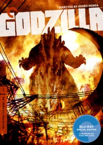
 There are few modern film institutions more beloved by film geeks than the Criterion Collection, as their exacting attention to the details of restoration, transfer, special features, creator involvement, and of course packaging has become legendary. While the collection has always had great taste and included a number of off-the-wall choices and genre favorites in with their catalog of art-house classics and foreign masterworks, fans were nevertheless excited to see such a prestigious group tackling the King of Monsters himself… Godzilla.
Unfortunately, it seems like the good folks at Criterion may have taken artistic license too far and caused Gojira purists to hang their head in shame, as hidden behind the awesome cover design of the DVD/Blu packaging is a bit of pop-up art… Taking a closer look, you may notice that the pictured creature is decidedly not the classic Gojira design of 1954, and instead something closer to the modern “Millennium Design” featured in several of the later Toho films. So while the cover we’ve seen is more vague (though the tail is apparently off on that too) about which design it’s aping, the inside cover makes it pretty clear.
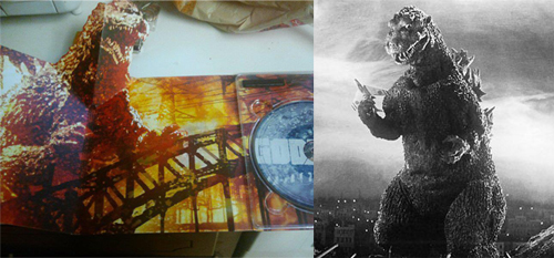
Criterion didn’t waste much time commenting in the Facebook photo thread that started the controversy, with a clarification that basically points to the artist who interpreted Criterion’s instructions as creating a composite of many design ideas that represent Godzilla…
Artist Bill Sienkiewicz used the original, ’54 Godzilla as reference for his artwork, but all of the renderings are nevertheless, in the end, Bill’s personal vision of the creature, albeit one that is Toho approved. We can see why some viewers consider it to be more akin to the 2002 incarnation of Godzilla because the back plates seem more sharp-pointed and jagged than the curved tips of the ’54 original, for example, or the tail tapers more to a point, but those plates don’t exactly mirror the ones from the 2002-3 monster either.
We pushed Bill to address Godzilla as a force of destruction, an elemental being, to step away from a rendering that would be purely literal and fetishistic in detail, and think he came up with a terrific interpretation. This is also why there is color in the packaging art. Although the movie is a beautifully-photographed B&W work, we kept leaning towards the elemental aspects of fire and water and wanted the color palette to evoke that.
I’m not sure I’m really convinced they made the best call here, as there’s no reason poor ole 1954 Gojira couldn’t have been interpreted as a badass without running to the modern designs for inspiration. The original suit had a more rounded, stop-motion-esque feel that is lost in today’s sharp, aerodynamic suits that are also very cool, but lack the naive charm of the ’54 version. Alas, this is the very definition of a first world geek’s problem, and it’s ultimately minor if the actual disc and its contents are as well put-together as one would expect.
Still, a bit out of character for Criterion, no?
A few commenter have pointed out that this is akin to releasing a DVD of the ’31 Dracula with a Gary Oldman interpretation on the cover, or perhaps a Dr. No pressing with a caricature that resembles Daniel Craig. My nose usually shoots sky high when nerds get their dander up over something like this, but you know, I think they may have a point on this one.
Of course, I by no means think anybody should be picketing the Criterion offices or boycotting the release… we need to support what this organization does, especially in a time when VOD and instant streaming are dragging picture quality and attention to cinematic context through the mud. Hopefully they’ll just keep a closer eye out next time…
If you still care to grab the release (and the inside art shouldn’t stop you), then look out for the set on January 24th.
What do you think? Is the design remarkably different? Does it matter?
Twitter
Comment Below
Message Board
(via Criterion Corner)






16 comments
I think Criterion assumed fans wouldn’t kick up too much of a fuss about the cover, since Godzilla’s back is to us and you can’t really see much of the design without rigorously studying it in detail.
I understand the marketing need to repackage an old movie with a cover that could draw the eye of the casual shopper, but they should also be careful about trying to “modernize” it as well.
At any rate, if the movie looks and sounds good on my screen, I can live with a poorly-conceived DVD cover.
The design of Godzilla doesn’t bother me as much as the overall package design; just looks sort of hokey. I could see it working for just about any other Godzilla film, but the first is so sombre.
Why should anyone give a rat’s ass? When I read the headline, I thought that Criterion had screwed up the transfer or decided only to include the U.S. cut or something.
We should just be happy Criterion took the time to give the deluxe treatment to this particular film. This is a stupid thing to get angry about. Almost as stupid as Matthew Fox.
This is almost as hilarious as the bitching that went on when the Batsuit was given nipples.
This is literally the most ridiculous thing I have ever read in my life.
Leave it to the mouth breathers to get up in a froth.
Sienkiewicz has always created beautiful work, but it is nothing if not stylized. Look for his Classic Illustraded of Moby Dick as an example of .
Pronounced Sink-Eh-Vich by the way.
THE FUCK?!
I have Elektra: asassin in hardcover. the man’s a feaking genuis. I still can’t beleive how badly they screwed up the movie Elektra.
Maybe if this wasn’t a Criterion release it wouldn’t be much of a deal. Other releases of the other movies nearly always have the wrong design/suit on the cover, and no one cares. Criterion is supposed to be for fans of cinema and history. Probably should’ve been the old ’54 design.
First world problems…
You cannot expect to get accuracy from Sienkiewicz, just brilliance. Read Electra Assassin, witness the brilliance and STFU. Or if you are really into jumping off the deep end, Stray Toasters.
LOL, nerds getting pissed off about nerds getting pissed off.
That cover looks positively restrained for a Sienkiewicz job. I want to see one with a toaster for a head.
Matthew Fox is SO stupid.
Comments are shown as archived from the original site; new comments are closed.