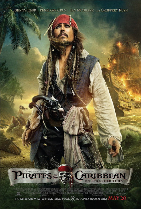
When I ran across the new Pirates of the Caribbean poster on Awards Daily, my reaction confused me. Clearly it’s another of the ‘shopped photo montages with the unifying grain smeared across the whole thing –pretty much the blockbuster standard– but I kinda like it.

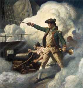
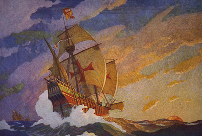
It seems some intrepid Disney graphic artist has finally figured out the right combination of filters to actually tie all of the masked-in images together into an evocative overall piece. It’s nothing brilliant, and certainly no legitimately painted Struzan, but as far as these kinds of things go…Daily pointed out that it is styled after N.C. Wyeth, an artist I was unfamiliar with, and that seems to definitely be the case, and probably a good reason why this doesn’t make me want to pry out my peepers.
The other thing to take from this poster is that Jack is front-and-center, and everything revolves around him. This is in-line with the trailer and every other indication from the production that promises a stand-alone ride that doesn’t discard its key character for large amounts of time. Whether or not that will make for a good film I can’t say, but the poster is nice. I hope other PR departments make note and approach their mercenary floating heads posters and crappy photo montages with a more distinguished eye in the future.
DISCUSS THIS on the CHUD Message Board
&
Like / Share it on Facebook (above or below) if you think it’s great!

